Brand Identity , Branding , Logo
Logo vs Branding vs Brand Identity – Understand the Difference

Standing out as a business in today’s world is a must. But, what makes a brand different, really? Many say it is all about the logo, but that is just one part of the puzzle. While the logo is the face of the brand, it is the entire branding process and the cohesive brand identity which ties everything together.
All of these, the logo, branding, brand identity– these are the components that define how people feel about your business, how much they can trust it, and even how they will connect to it. When everything works out right, it really helps in making your brand leave a mark.
Let’s break down these ideas and understand them simply.
Logo: It is a simple picture or symbol that represents your company and helps people recognise it quickly.
Branding: The overall process of shaping how people perceive your brand through your words and actions.
Brand Identity: It is the collection of visuals, like colours, fonts, and your logo, that consistently show what your brand stands for everywhere it’s seen.
1. Is the Logo just a symbol or more?
A Logo is far more than just a symbol. It’s part of what makes a brand special and acts like the physical profile of a company. It shows what the business is all about in a way that people can easily recognise and remember. A good logo shares the company’s values and character, which helps build trust and makes the brand stand out from others.
Components in a Logo:

- Symbols/Icons:
These visual elements might be simple or detailed images that capture what the brand is all about in just a quick look. They’re really effective because they can share big ideas quickly and in a way that people remember. - Typefaces:
The type of font used in a logo is really important because it helps show the logo’s personality. Fonts can make a logo seem strong, elegant, fun, or many other things. Picking the right font is key to making sure the logo fits well with what the brand is all about. - Colour Palette:
Colours in a logo carry meanings and emotions that can significantly impact consumer perception. Each colour has different implications and can trigger various emotional responses. For example, blue often represents professionalism, security, and trust, while red might evoke excitement and passion. - Scalability:
A good logo must be scalable, where the impact and legibility must remain the same when it is applied in a different size or format. In other words, the watch logo can be seen even on a billboard and vice versa. This simply implies that it should have a clean and adaptable design in different contexts and formats.
Some Logos with the Best Creativity

- Netflix:
The bold, minimalist Netflix logo immediately draws one’s eye to the simple red wordmark. Vibrant red symbolises energy and excitement; thereby, mirroring this, the platform offers content that is thrilling and diverse. - FedEx:
The FedEx logo is renowned for the cleverly hidden arrow between the ‘E’ and ‘x’, symbolising speed, precision, and a forward-moving direction, reflecting the company’s efficient delivery services. - Amazon:
One of the most recognisable logos worldwide, Amazon’s logo features a smile-shaped arrow pointing from “A” to “Z.” This cleverly represents Amazon’s vast range of products, while the smile symbolises customer satisfaction, reflecting their goal to make shopping enjoyable. - Airtel:
The smooth, curved “a” in Airtel’s logo gives an impression of fluidity and movement. The red colour is full of vibrancy and energy, representing the brand’s dynamic approach and commitment to keeping people connected. - SBI:
SBI’s logo is all about simplicity and symbolism. The blue circle, with its keyhole-like cutout, represents security and trust, showcasing the bank’s reliability and its role as a safe haven for millions of customers
2. Branding: The voice of your business
Branding is like telling a story about your business so that people understand what you do and like you. It’s about how you show the world what your business stands for by using special colours, a logo, and messages.
While the process of branding helps guide what you want people to think about your company, the brand is what people actually think and feel about it after they see your logo or use your products. On the other hand, brand identity includes everything, like your logo and colours, that you always use so that people can easily recognise your business. You want all these things to match the story you’re telling.
Process of Branding:

- Market Understanding:
This step is about conducting in-depth research to get an understanding of the business landscape, including competitor analysis and customer behaviour.
Knowing the market helps you determine what your potential clients want and expect. This helps you to modify your products, services, and marketing methods to meet these demands while enhancing customer satisfaction and trust. - Portraying the Core Values:
This involves describing your company’s objective, goal, values, and unique selling points. It shows the core values of the brand and its commitment to customers, leading all future branding activities and decisions. - Creating Your Brand’s Look:
It creates an impressive visual impact for your brand, including the logo, colour scheme, typography, and all other graphics. It’s those features that should stand out uniquely and be memorable to represent the brand’s identity in order for the brand to be easily identified. - Developing How Your Brand Talks:
Creating your brand’s voice is like deciding how it talks to everyone. It’s about choosing a friendly, serious, or fun way to speak that makes your brand easy to recognise and trust. This helps people like and remember your brand whenever they hear about it. - Making Clear Brand Messages:
Making clear brand messages means carefully crafting words that tell everyone what your brand is all about. This step is about using simple, direct language that speaks directly to your audience, explaining why your brand is unique and why they should care. These messages need to be consistent across all your marketing to help build a strong, trustworthy brand identity that resonates with customers and sticks in their minds. - Setting Realistic Guidelines:
Setting realistic guidelines involves creating clear rules for how your brand appears everywhere—from logo placement to colour use and tone of voice. These rules ensure consistency, enhancing your brand’s recognition and reliability. Straightforward guidelines help everyone accurately represent your brand, maintaining a cohesive identity. - Reaching to your Target Audience:
Reaching your target audience means finding the right people who might like what you sell and talking to them in ways they enjoy. This includes using ads, social media, and emails that catch their interest. By doing this, you make sure more of the right people hear about your brand. - Modifying the Content as per needs:
Modifying content as needed means changing your messages, pictures, or ways you talk to match what your audience likes and what’s new. This keeps your brand interesting and up-to-date. By listening to what people say and watching what works, you can make your brand better and more liked.
World-Class Branding and Winning Strategy

- Apple:
Apple’s branding focuses on innovation, minimalism, and premium design. Their clean and minimalistic aesthetics across products and advertising, along with a strong emphasis on product innovation, positions them as a luxury tech brand. - Nike:
Nike uses emotional branding by associating its products with aspiration and achievement. Their “Just Do It” slogan encourages people to push beyond their limits, which is reinforced by endorsements from top athletes. This strategy builds a motivational brand image. - Starbucks:
Starbucks focuses on the experience rather than just the coffee. Their stores are designed to be cosy and inviting, creating a ‘third place’ between home and work where customers can relax. This emphasis on atmosphere has set them apart in the coffee industry. - Amazon:
Known for its customer-centric approach, Amazon’s branding strategy is all about convenience, variety, and speed. They consistently focus on making shopping as easy and fast as possible, which is communicated through their customer service and innovations like Prime. - Coca-Cola:
Coca-Cola connects with people by focusing on happiness and sharing. They make campaigns like “Share a Coke,” where people find bottles with their names on them, creating a personal touch.
3. Brand Identity: The face of your business
Brand identity refers to how your business portrays itself to the world: a blend of visual and emotional elements that define who you are. From the logo and colours to fonts and general style, it’s what people recognise when they see your brand.
It’s the face of your business that makes you stand out and memorable. It is not only a visual event; however, brand identity also relates to the tone your messaging carries and the values that you portray.
All of these combine to create a unique experience that helps people understand what your business is about and why they should connect with you.
Elements of Brand Identity:

- Logo:
The logo is the most recognisable element of your brand. It’s a symbol or design that represents your business and leaves a lasting impression. A well-designed logo is simple, memorable, and reflective of your brand values. - Color Palette:
Your brand’s colour palette influences how people feel when interacting with your brand. Colours evoke emotions and can significantly impact customer perception. Consistent use of colours across all platforms creates a cohesive and professional brand look. - Typography:
Typography refers to the fonts used in your branding materials. Fonts convey tone and personality, whether formal, playful, or modern. Choosing the right typography ensures your messaging is clear and aligned with your brand’s voice. - Imagery Style:
The images and visuals your brand uses, from photography to illustrations, should align with your brand identity. Consistent imagery helps tell your brand’s story and adds to the overall aesthetic, creating a stronger connection with your audience. - Brand Voice:
Brand voice refers to the tone and style of your communication. Whether it’s friendly, professional, or authoritative, having a consistent brand voice helps in building trust and familiarity with your audience, making all your messaging sound cohesive. - Website and Digital Presence:
Your website and digital presence are essential in how your audience experiences your brand online. A well-designed, easy-to-navigate website that reflects your brand’s identity enhances credibility and engages customers, turning visits into actions. - Advertising and Marketing Materials:
Your brand’s advertising and marketing materials, from social media posts to print ads, should consistently reflect your brand’s identity. This helps build brand recognition and ensures that all touchpoints are aligned with your overall message and design elements.
Leading Examples of Strong Brand Identity

LEGO
LEGO symbolises creativity and imagination through brand identity. The colourful bricks and playing logo leave you with a notion of having fun as anything can be played with. In the design of its products, packaging, or advertisements, LEGO is a consistent building and creation brand. Amazingly, this company’s interactive experience and engaging visuals all back up its core identity of inspiring creativity.
IKEA
The brand identity of IKEA focuses on simplicity and functionality yet is economic. The bold use of a bright blue or yellow background coupled with clean typography reveals their no-nonsense approach to furniture products.
IKEA is popular for offering modern and easy-to-assemble furniture, and the brand identity reflects this with clear communication and consideration of everyday consumers.
Catalogues, store layouts, and online platforms are characterised by an overall design and feel that doesn’t stray far from being fairly simple and terribly cheap.
Patagonia
Sustainability and responsibility toward the earth are what Patagonia’s identities are all about. Earthy shades, rugged typography, and a minimalist design reflect their loyalty to nature and adventure.
Their brand voice sounds authentic and advocacy, hence reacting well to consumers who are concerned with the environment. Sustainability is put into every product, the package to corporate practice.
By putting this into every product, the identity developed by Patagonia holds them tight with the people who prioritise the planet.
Airbnb
The brand identity of Airbnb is deeply based on the idea of “belonging anywhere.” A simple and friendly logo, along with a set of pastel colours, makes the firm feel warm and welcoming.
Messaging and visuals of Airbnb continuously focus on creating experiences and connections rather than providing shelter. The emotional appeal helps build trust and makes users feel part of the global community.
The website and app design are intuitive, ensuring the overall aim: that of helping one to feel at home everywhere.
Spotify
Spotify’s brand identity is centred around personalisation and discovery. Its dark green and black logotype, modern typography, and dynamic user interface make music exploration personal and exciting. The brand powers its data to create customised playlists and recommendations that keep the customer engaging.
A clean and easy-to-use platform is a reflection of their focus on delivering an effortless music experience, in which their bold, music-centric advertising reinforces their identity as a hub for discovery and creativity.
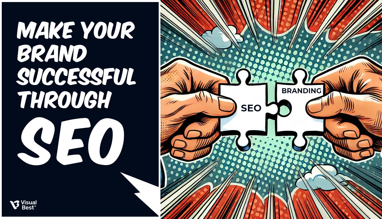
4. How Logo, Branding, and Identity Fit Together in the Puzzle?
Logo, Branding, and Brand Identity work together to shape how a business is seen and understood by its audience. Think of your logo as the visual representation or “face” of your brand—it’s what people instantly recognise.
Your branding, however, is the whole experience that people have with your company, from your message to the emotions that your products or services evoke. Brand identity ties it all together because everything from the logo, colours, fonts, and tones that you use needs to be consistent with the core values of your organisation. If all three come together, they form a great, cohesive image that evokes trust, recognition, and customer loyalty.
At Visual Best the Best Designing Agency in India, we bring these elements together seamlessly. From creating a standout logo to building a cohesive brand identity and managing your overall branding strategy, we handle every component to ensure your business makes a lasting impression across all platforms.

 +1 445-266-1603
 +91 96504 08093


